Part 3 - Componentization
Our List of Pyroes can be displayed and individual Pyroes can be edited, but it is all an amalgam.
Since we are already doing it with our main application component,
AppComponent, and the listing component, PyroesComponent and how it is
better done when creating large applications, we can separate the listing and
editing functionalities.
Copy the top2 folder to top3 and enter it. For example, with:
cp -r top2 top3
cd top3
Note
Under Windows and unless you have a proper shell installed (Cygwin, MSYS, GitBash, …) you are probably better off using the Windows Explorer to make a copy of the directory)
Adding a PyroDetailComponent
Just as we did before to create PyroesComponent, we can do it for
PyroDetailComponent. From inside the app directory create the skeleton for
a Component:
anpylar-component PyroDetail
The view of the project layout is now
├── app
│   ├── pyro_detail
│   │   ├── __init__.py
│   │   ├── pyro_detail_component.css
│   │   ├── pyro_detail_component.html
│   │   └── pyro_detail_component.py
│   ├── pyroes
│   │   ├── __init__.py
│   │   ├── pyroes_component.css
│   │   ├── pyroes_component.html
│   │   └── pyroes_component.py
│   ├── __init__.py
│   ├── app_component.css
│   ├── app_component.html
│   ├── app_component.py
│   ├── app_module.py
│   ├── mock_pyroes.py
│   └── pyro.py
├── anpylar.js
├── index.html
├── package.json
└── styles.css
We’ll now move the details part from the html content of PyroesComponent to
the html content of PyroDetailComponent. Both html files.
<h2>My Pyroes</h2>
<ul class="pyroes">
</ul>
<pyro-detail></pyro-detail>
<div *_display=selected_.pyd_>
  <h2 {name}="selected_.name_.map(lambda x: x.upper())">{name} Details</h2>
  <div><span>pyd: </span><txt [selected_.pyd_]>{}</txt></div>
  <div>
      <label>name:
        <input *_fmtvalue=selected_.name_ placeholder="name"/>
      </label>
  </div>
</div>
Things to notice:
In
pyroes_component.htmlwe added a new tag:<pyro-detail></pyro-detail>This is where the
PyroDetailComponentwill be auto-rendered.To make sure this is the case, we will define the
selectorto have this specific value inPyroDetailComponentThe html in
pyro_detail_component.htmlstill references the observableselected_. Recall that this was defined inPyroesComponentand in fact: it will still be.
Let’s see the Python counterparts before delivering the full explanation
from anpylar import Component, html
from .pyroes import PyroesComponent
from .pyro_detail import PyroDetailComponent


class AppComponent(Component):

    title = 'Tour of Pyroes'

    bindings = {}

    def render(self, node):
        PyroesComponent()
from anpylar import Component, html
from app.pyro import Pyro
from app.mock_pyroes import Pyroes


class PyroesComponent(Component):

    bindings = {
        'selected': Pyro(),
    }

    def render(self, node):
        with node.select('ul'):  # find the node where to display the list
            for pyro in Pyroes:
                with html.li() as li:  # create a list item per Pyro
                    # if the selected pyro is this pyro ... set a class attr
                    li._class.selected(self.selected_.pyd_ == pyro.pyd)
                    # bind a click to do self.selected_(pyro)
                    li._bindx.click(self.selected_, pyro)
                    # show the pyd in a <apan> as a badge (child of list item)
                    html.span(pyro.pyd, Class='badge')
                    # show the name as text inside the list item
                    html.txt(' {name}')._fmt(name=pyro.name_)
from anpylar import Component, html


class PyroDetailComponent(Component):
    selector = 'pyro-detail'

    bindings = {}

    def render(self, node):
        pass
Parent-Child Relationship
As mentioned above, the observable selected_ is defined as a binding in
PyroesComponent. It is nowhere to be seen in PyroDetailComponent, but
the associated html content uses it. A Master-Child or Parent-Child or
Component-SubComponent relationship is responsible.
Remember the html content for PyroesComponent:
<h2>My Pyroes</h2>
<ul class="pyroes">
</ul>
<pyro-detail></pyro-detail>
...

class PyroDetailComponent(Component):
    selector = 'pyro-detail'

    ...
The <pyro-detail> tag and the selector = 'pyro-detail' are the
keys. Because it happens inside the html code for PyroesComponent, when the
associated component for the tag is instantiated (namely
PyroDetailComponent) it will become a child of the component in which
is being created.
Being a child, it can access the bindings from the parent. Hence the
capability to use the selected_ observable.
Note
As done with PyroesComponent, which is instantiated inside
AppComponent, we could have done the same with
PyroDetailComponent
In this case and to show an alternative, we have chosen to instantiate using a tag and defining a selector
Importing pyro_detail_component
You may have noticed that we also shown app_component.py in the code
samples above. And this is to show this
from anpylar import Component, html
from .pyroes import PyroesComponent
from .pyro_detail import PyroDetailComponent

...
PyroDetailComponent needs to be imported somewhere. It can be done in
this module or it could for example be done in app_component.py or even in
pyroes_component.py: the choice is yours.
But if not imported: it will be just a file being idle in your file structure. Importing it, makes the component be part of the arsenal you can use in your app.
Let’s execute
We haven’t changed the functionality, simply how we distribute the functionality across components. The results are the same as in the previous example.
anpylar-serve top3
And go the browser
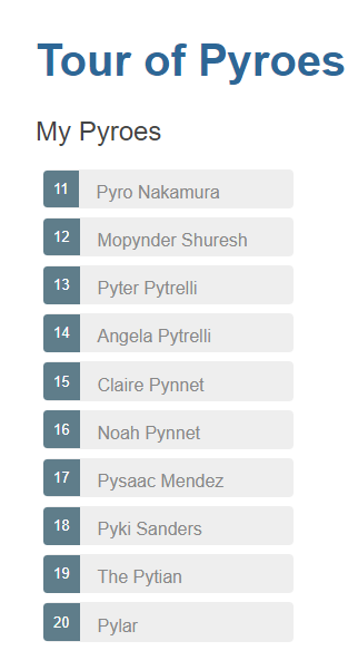
And our list of Pyroes will be displayed
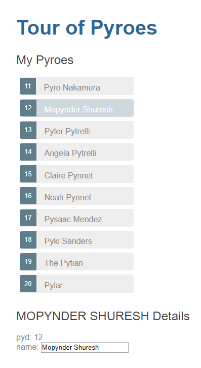
Clicking on one of the Pyroes will:
Show the editor
Change the class of the selected Pyro so that it becomes highlighted
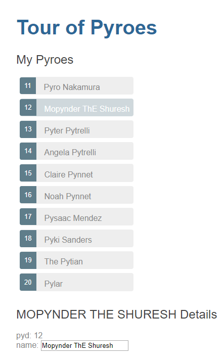
And making changes in the editor is automatically reflected not only in the
input field, but also in the uppercased name in the editor and in the list
of Pyroes
Now that things have been broken down in different components, we can move on.